
DORA measures software delivery with five metrics: change lead time, deployment frequency, failed deployment recovery time, change fail rate and deployment rework rate. Measure them per application, from your Git host and your deploy records. Improve them by making each change smaller and the path to production automatic, then check that speed and stability move together.
A CTO told me, with full confidence, that his team measured DORA. Three minutes of follow-up questions later, neither of us was confident anymore. I wrote that up in The Platform Radar. This is the other half: how we pull each number from raw pipeline data on two systems, and the two numbers we couldn’t get.
What are the five DORA metrics?
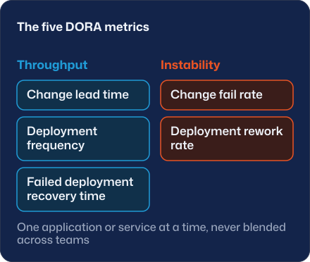
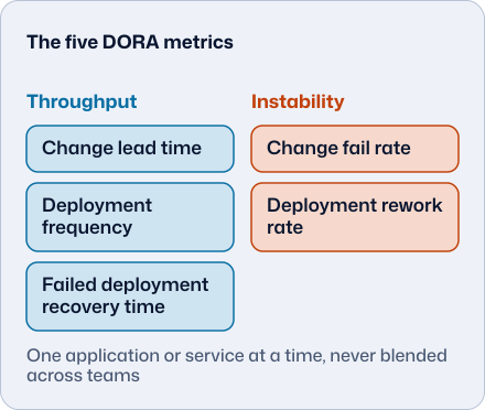
DORA’s current guide splits delivery performance into throughput (how many changes move) and instability (how well they land).
| Group | Metric | What it times or counts |
|---|---|---|
| Throughput | Change lead time | From a change committed to version control until it is deployed in production |
| Throughput | Deployment frequency | Deployments over a period, or the time between them |
| Throughput | Failed deployment recovery time | How long it takes to recover from a deployment that fails and needs immediate intervention |
| Instability | Change fail rate | Share of deployments that need immediate intervention afterwards, usually a rollback or a hotfix |
| Instability | Deployment rework rate | Share of deployments that are unplanned and happen because of a production incident |
The model used to have four keys. Mean time to restore was replaced by failed deployment recovery time, so a dashboard that still says “MTTR” is measuring an older definition. DORA also says the metrics apply to one application or service at a time, never blended across teams, and that speed and stability “are not tradeoffs”.
How do you measure change lead time?
Pick the two timestamps first, because the choice changes the number. You can start the clock at the commit, using the author date, which is DORA’s definition. Author dates survive a rebase, so the result is an upper bound. Or you can start at the merge to the main branch, which is easier to get from a Git hosting API and ignores time spent on a feature branch.
Our two examples use different clocks, so don’t compare them directly. On MPI, a portfolio-analytics SaaS platform, we measured merge to production: a median of a week to 10 days from April to July 2026, and 3 to 4 days in September. On the Autonomah platform we measured commit to production. For each SemVer release we took every commit in previous_tag..tag and subtracted from the end of the first successful production run for that tag.
Report a median and a 90th percentile, never an average. The last 50 Autonomah releases give a median of about 7 hours and a p90 of about 23. The number I like more is how long the newest commit in a release waits: a median of about 10 minutes. So the pipeline is fast, and the wait happens before the release is cut.
How do you measure deployment frequency?
Count successful deploys to production, and write down what a deploy is before you count. A tag doesn’t count, and neither does a pipeline run that failed. On Autonomah a deploy is a pipeline run that moved the production service and finished with success: 127 of them in about two weeks, nine or ten a day. On MPI it is a release that reached production through the release process, about one a week before and nearly four a week in the last 30 days, about three times more.
Always state the window. “68 deploys in a week” is true for one complete calendar week on one product, and for nothing else.
Why can’t most teams measure change fail rate?
Because the metric needs a link between a deploy and a production failure, and most teams never record that link. A failed pipeline run is not a failed change. A failed change reached users and needed a rollback or a hotfix.
Both of our examples have the gap. On Autonomah, 7 of 134 completed deploy runs failed (about 5%), and that is pipeline failure. The repository has no incident record that ties a release to a production failure, so change fail rate and failed deployment recovery time can’t be measured there. There’s no number for them here. On MPI, the share of failed production release pipelines fell from 23% (77 of 334, all time) to 4% (1 of 25 since July 2026). That is a real improvement in how reliably a release gets through. It doesn’t tell you how often a release hurt users.
Rollback time is just as easy to misread. On MPI we rehearsed a rollback by re-promotion end to end in the development environment: a bit over a minute back and about two minutes forward. Nobody has measured a production rollback, so treat that as what the mechanism can do. Recovering production is a different measurement.
If you want these two metrics, add one field to your incident template: “caused by release vX.Y.Z”. It’s one field.
How do you improve DORA metrics?
DORA’s own advice starts with batch size: smaller changes move faster and are easier to recover from. What moved the numbers on MPI was removing waiting.
Every merge reaches development without a person pressing anything. From there, Kargo on top of Argo CD promotes a release to production with a 1-hour soak and verification gates (smoke checks at the edge, pod restart and readiness checks, an HTTP 5xx ratio gate) instead of an approval by chat message. Database migrations run in a pre-sync hook with an automatic snapshot before them, so the migration travels with the release and stops being a separate manual step. And seven manual steps plus a four-part certification became one promote action that runs a 79-step automated template. The Argo CD and Kargo post shows how each piece works.
The first release through the new pipeline reached production in about 2 hours, including the 1-hour soak. That’s a single release, so it shows what the path allows and nothing about the new median.
Autonomah is short by design. Every SemVer tag builds, migrates and deploys by image digest, and the pipeline takes a median of five or six minutes.
What mistakes should you avoid?
DORA’s guide lists several pitfalls, and three show up on almost every engagement we join.
Turning a metric into a target. “Every team deploys daily by Q4” invites people to game the count. Use the numbers to find the constraint.
Blending applications. An organisation-wide lead time mixes a monolith that ships monthly with a service that ships hourly. The average describes neither.
Measuring instead of improving. Building integrations to get perfect numbers can cost more than the first improvement would. DORA itself suggests starting with conversations or its Quick Check.
One more from me: a number with no window and no population is decoration.
Do speed and stability really go together?
DORA says they do, and that top performers do well across all five metrics. Our data is consistent with that on the part we can see: on MPI, release frequency went up about threefold while release pipeline failures fell from 23% to 4%. We can’t make the claim for instability, because production change failures were never recorded in a way we could count.
If the bottleneck turns out to be the promotion path, that’s platform engineering work: promotion pipelines, gates, and a portal that shows what is deployed where. Before you call anyone, pick one service, pull the last 90 days of merges and deploys, and compute the median lead time. If it’s measured in days, look at the promotion path first. Then add the “caused by release” field to your incidents so change fail rate is measurable next quarter. The platform engineering service describes how we work, and every package is on the pricing page.
Sources, accessed 2026-10-07: DORA, software delivery performance metrics.